Soul Urban Bistro
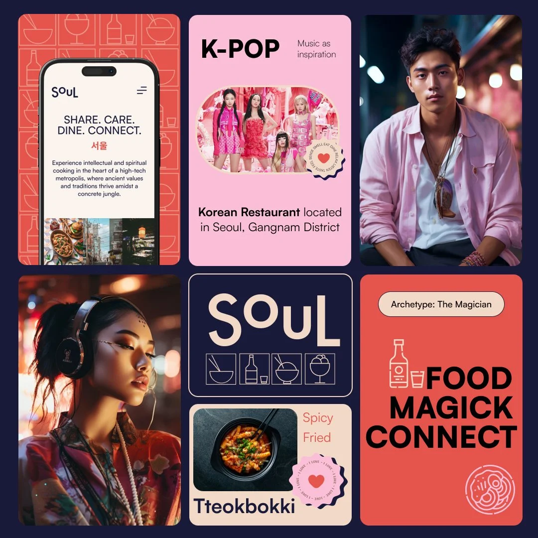
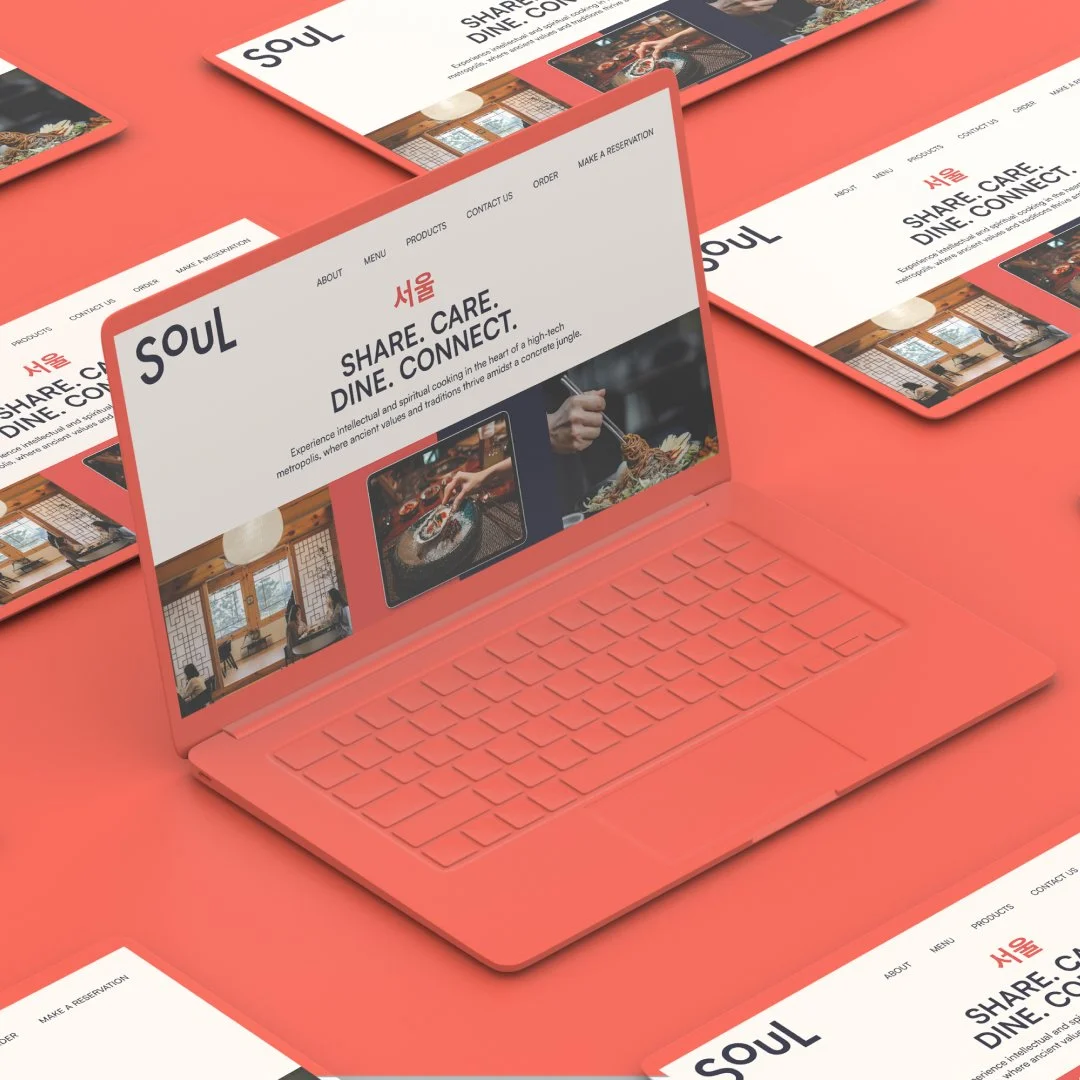
The visual identity of Korean Restaurant “Soul” combines the rich history and modern elegance of the area, creating an experience that resonates with the dynamic energy of Gangnam.
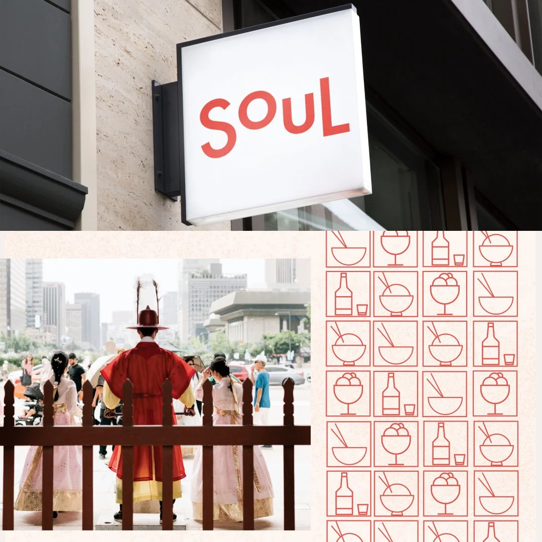
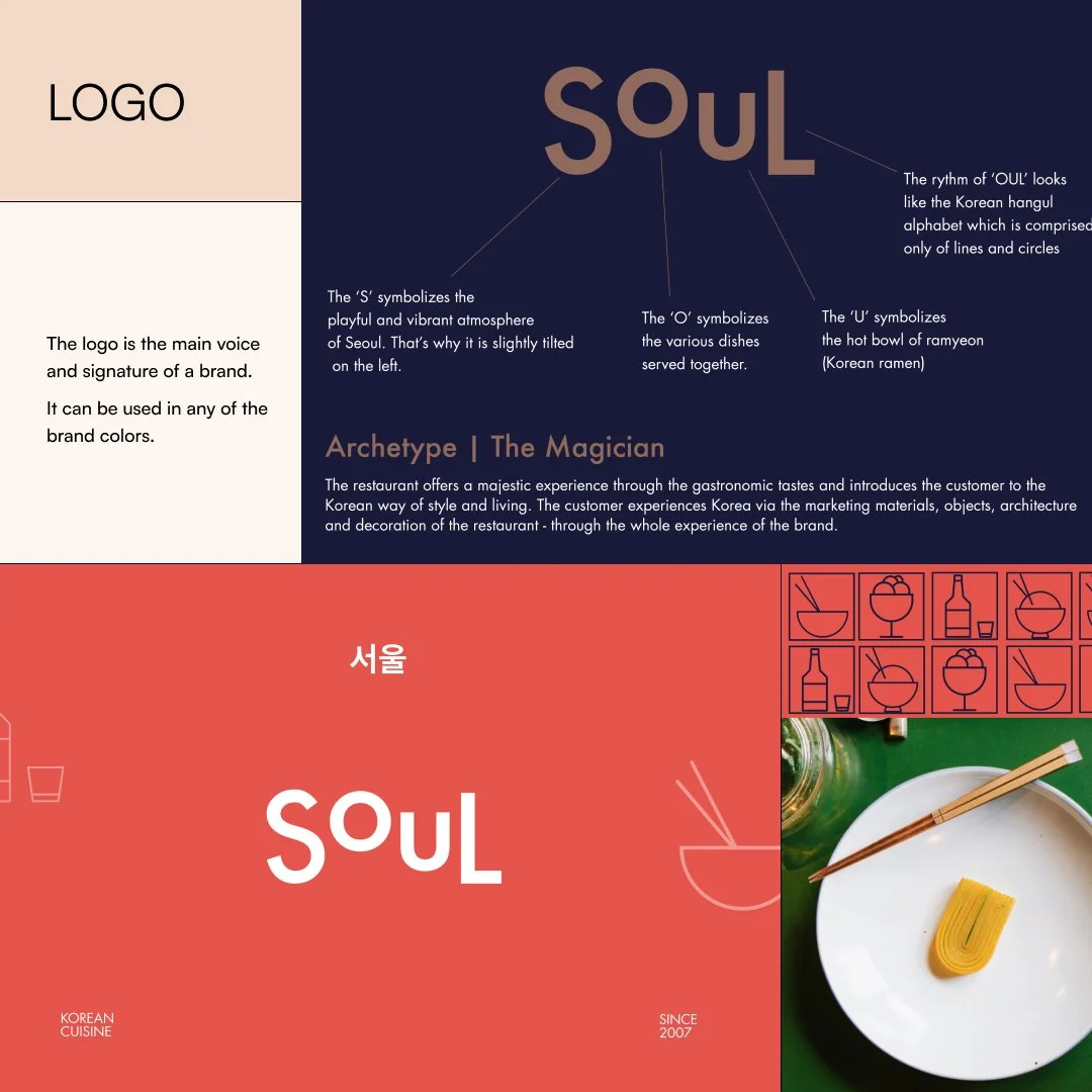
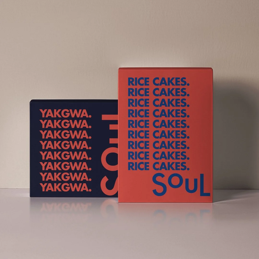
Logo: The logo captures the essence of Seoul with a modern twist. The position and rhythm of letters brings the hangul alphabet to mind. The movement in the letters symbolise the playful and vibrant atmosphere of Seoul. That’s why the letter ’S’ is slightly tilted on the left. The ‘O’ symbolizes the various dishes served in the restaurant. The letter ‘U’ symbolizes a hot bowl of ramyeon.
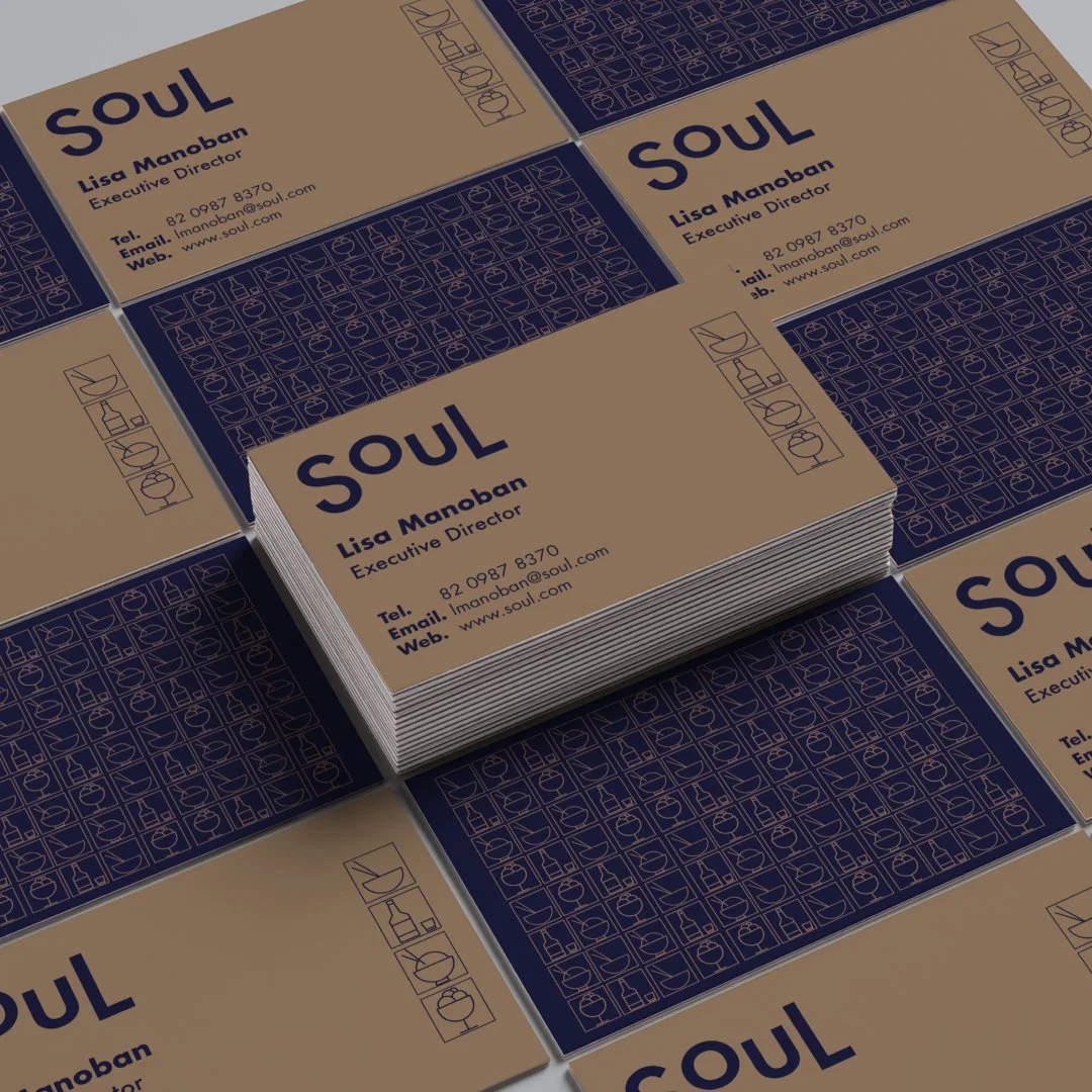
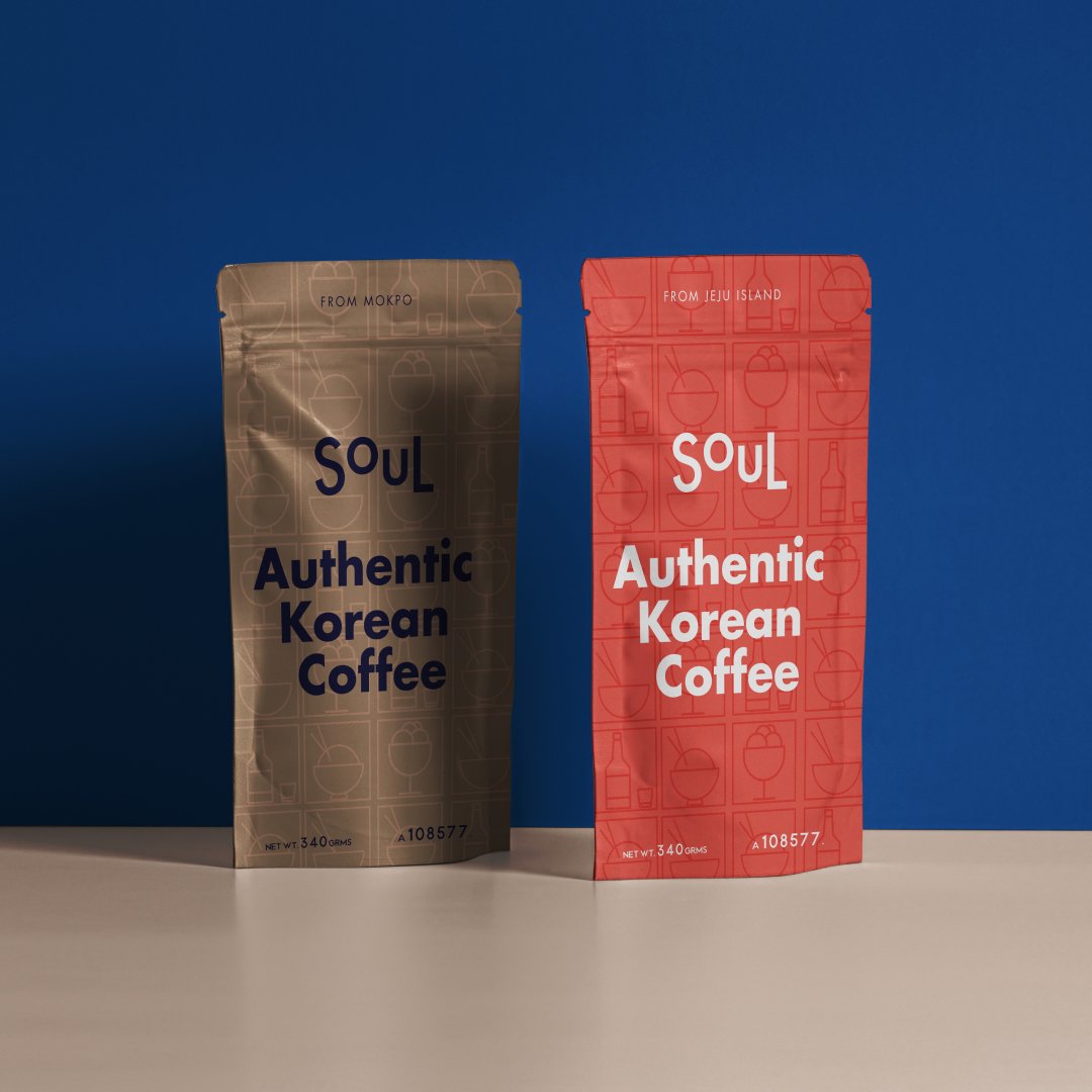
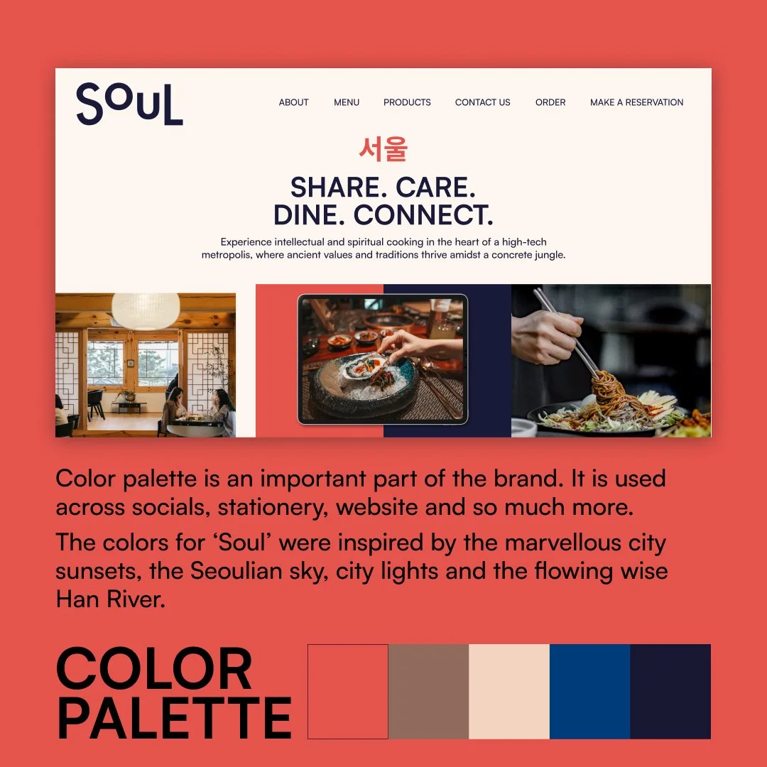
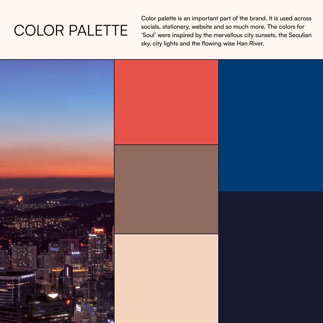
Color Palette: Our color palette exudes the vibrancy of Gangnam. Coral, inspired by the city's energetic nightlife, is paired with deep blue, reflecting the district's sophisticated urban aesthetic. Subtle accents of beige and golden highlights pay homage to the city's lush parks and cultural richness.
Typography: We've chosen a modern and geometric sans-serif typeface to represent the contemporary aspects of the brand. The font is elegant and legible, mirroring Gangnam's reputation for refinement and sophistication.
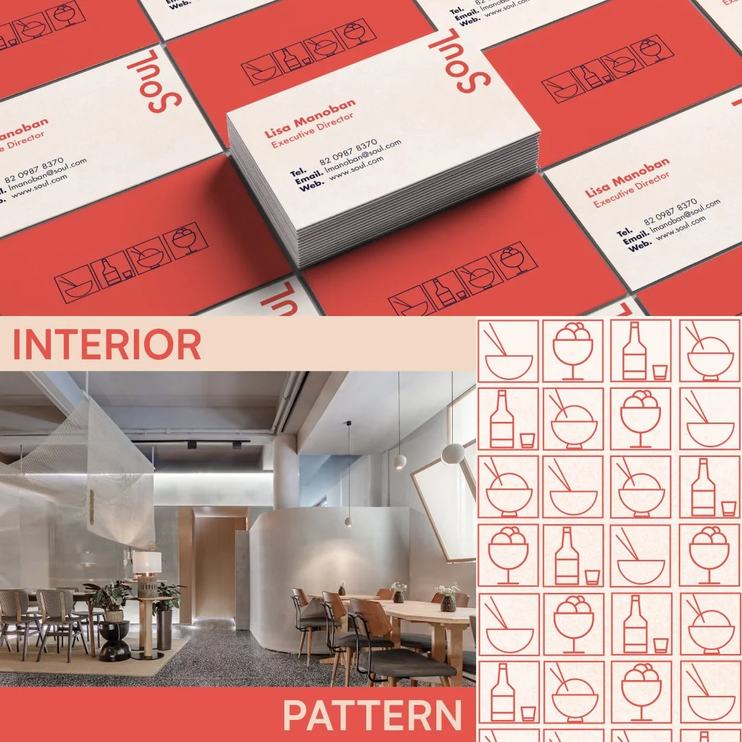
Décor: The restaurant's interior embodies modernity through a blend of minimalism and luxury. Polished concrete floors and sleek, dark wood tables contrast with warm coral accents. Traditional Korean art pieces are tastefully displayed, offering a nod to heritage amidst the modern ambiance.
Soul Urban Bistro is a haven in the heart of Gangnam, where the past and the future converge. Our brand design captures the essence of Gangnam's dynamic energy while paying homage to the rich tradition of Korean cuisine.